We built a dated eye care website.
Then we rebuilt it.
Wrenfield Family Eye Care does not exist. We invented the practice, built the tired website it might have had, and rebuilt that site with OptiSite. The whole process sits in one picture instead of being described to you.

Is this a real practice?
No. The practice in this demonstration, its town, its doctors, its reviews and its phone number are all invented. We built both websites below ourselves, which is the point. It lets us show the problems a dated practice website really has, and what a rebuild does about them, without putting words in a real practice’s mouth. For a rebuild of a real practice with measured before-and-after figures, see the rebuild we published.
Get My Free Audit- Both screenshots are real pictures of pages we built
- No scores, grades or percentages — nothing here is measured
- Desktop and phone, taken 20 September 2026
- Same practice name, same services, same hours on both
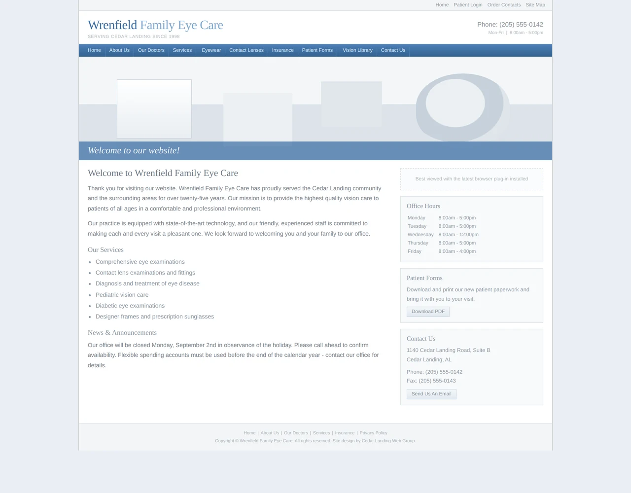
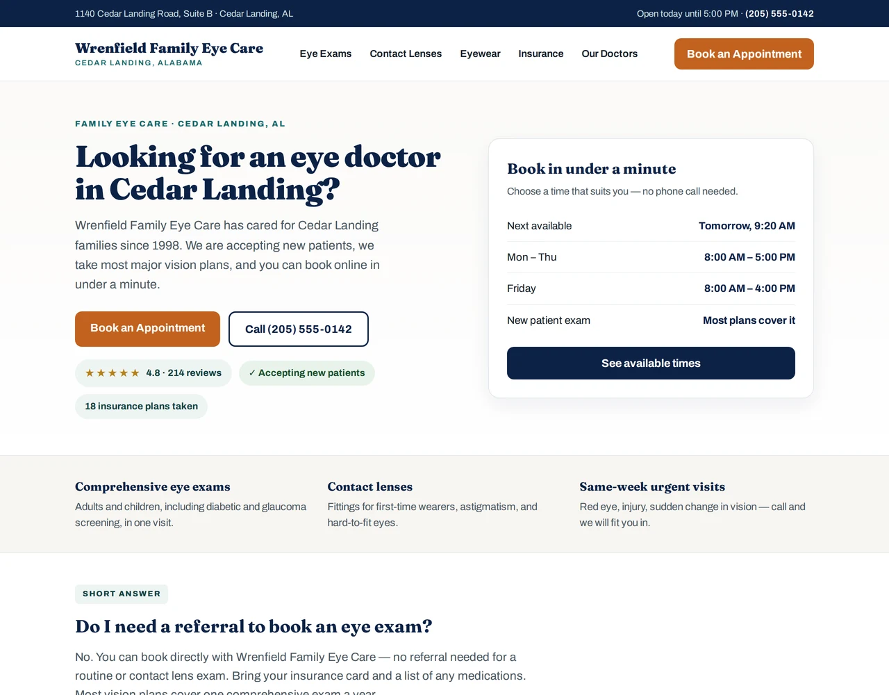
The screenshots could not be loaded.
The two images compared here are a dated practice website we built and the same content rebuilt with OptiSite. If they are not showing, the anonymous rebuild we published covers the same ground with a real practice.
Both halves were built by us. The left is a dated practice website we made on purpose. The right is the same content rebuilt with OptiSite. The screenshots show the design and structure changes. No practice, patient or measured result is depicted.
What the rebuild changed
Try the Mobile button above. The dated site was built at a fixed width. So a phone gets the full desktop page, with the right-hand third hanging off the screen. Sentences are cut off mid-word, and the menu links are too small to tap. That is not a matter of style. Most of a practice’s traffic comes from phones.
- The headline answers a question. “Welcome to our website” tells a patient nothing. “Looking for an eye doctor in Cedar Landing?” is the thing they typed.
- Booking and the phone number are easy to reach. A button a thumb can hit, and a number you can tap instead of grey text in a corner.
- The facts a patient checks are near the top. Accepting new patients, how many insurance plans are taken, the rating, the next open slot, the hours.
- Text is easy to read and buttons are easy to tap. The pale grey on white in the original fails the accessibility standard (called WCAG 2.2 AA). So do ten 10-pixel links in a row.
- It fits a phone. Same content, no side-scrolling, no pinching.

What this page is and is not. Both websites above were built by OptiSite for this demonstration. The practice, the town, the doctors, the reviews, the insurance figure and the phone number are invented, and the phone number is in a range reserved for fiction. Nothing here is a customer, a measurement or a claim about results. There are deliberately no scores on this page. The screenshots were taken on 20 September 2026 on a desktop screen (1280 pixels wide) and a phone screen (390 pixels wide), and were not edited afterwards. For a rebuild of a real practice with measured before-and-after figures, see the anonymous rebuild we published, and how we verify the work.
More on this page’s topic
Is the practice in this demonstration real?
Why show a made-up practice instead of a customer?
What actually changed between the two screenshots?
Does this demonstration come with audit scores?
Will my rebuild look like this one?
How do I see what my own site looks like today?
Now see what your own site looks like.
Independent optometry practices · $0 until you’re live · 12-month plan · checked every month
Get the free audit
We check your site and email you what it finds, including what OptiSite would fix.
Get My Free AuditYour report emailed within 1–2 business days. No card, no obligation.
Talk it through first
Thirty minutes with Jason. Bring your site, your questions and your current bill.
Book A 30-Minute CallA real person, not a queue.